
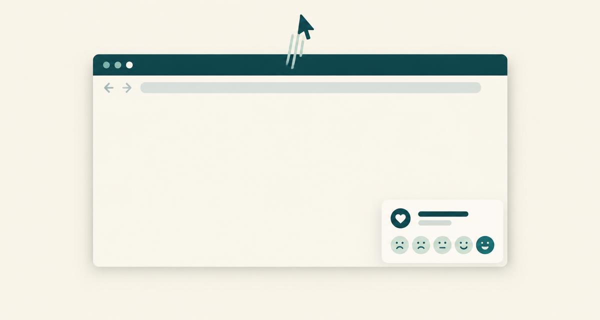
How exit intent works on desktop
Browsers don't tell a website that someone is about to close a tab or click Back. What a page can see is the mouse. When the cursor moves quickly upwards and leaves the page through the top edge - towards the tabs, the address bar or the close button - that is a strong hint that attention is going elsewhere.
That is all exit intent is: a hint. It can't know whether the visitor is closing the tab, opening a new one or checking another window. So treat the answers as feedback from people who were drifting away, not as a precise count of people who left.
- Top edge only. Moving out through the sides or bottom is usually scrolling or reaching for something else, so it shouldn't count.
- Wait a moment first. Someone who leaves after two seconds hasn't seen enough to give a useful answer.
- Once per visit at most. If they dismiss it, respect that.
Why phones need a different trigger
On a phone there is no cursor, so there is nothing to detect. Tools that claim "mobile exit intent" usually mean one of these alternatives, and it's worth being explicit about which one you use:
- A quick scroll back up. People often flick upwards to reach the address bar or the menu before leaving. It's the closest mobile equivalent.
- Time on page. Ask after someone has spent, say, 30 seconds without acting.
- Scroll depth. Ask once someone has read far enough to have an opinion.
- A specific event, such as the visitor starting a form but not finishing it.
Good practice
- Ask one question. "What stopped you from continuing?" gets more answers than five fields.
- Make answering optional and closing easy. A visible close button, and Escape on desktop.
- Limit how often one visitor sees it. For example once per visit and not again for several days after answering.
- Don't ask people who succeeded. Pause the survey once a visitor has submitted the form you care about.
- Keep it off sensitive pages, like checkout steps or account pages, unless that's exactly what you want to learn about.
- Don't collect what they typed in your forms. You want their opinion, not their data.
Common mistakes
- Using it as a discount pop-up and a survey at once. Visitors learn to dismiss it.
- Showing it on every page. Pick the pages where leaving actually matters.
- Reading the answer count as a leave rate. It's a sample of opinions, not analytics.
How The Little Ask handles it
On desktop, The Little Ask watches for the cursor leaving through the top edge after a short delay. On phones it offers a quick-scroll-up trigger instead, plus time, scroll depth and form events. Each campaign has page rules and frequency limits, can pause after a successful form submission, and never reads the values visitors type into your forms. It never claims to detect the close button.
Using exit intent on forms